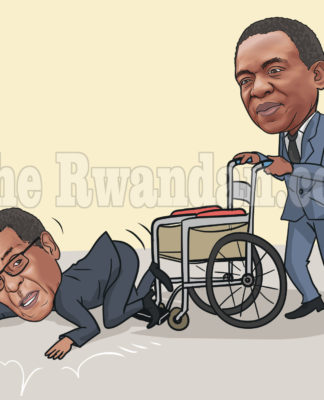
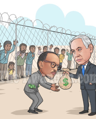
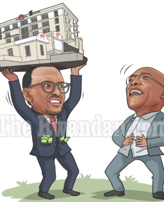
Continuing our exposé of the Rwandan government’s subterfuge (and World Bank and IMF complicity) roape.net’s expert reveals what is really going on behind the states recent poverty statistics. This blogpost finds an increase in poverty which is too large, too sustained, too wide-spread, and the findings too robust and too compelling to be ignored, or to be dismissed as mere statistical blips or methodological quirks. The evidence published on roape.net, shows that as the government continues to spend its meagre resources on unprofitable five-star hotels, empty skyscrapers, and even the president’s favourite football club, and imprisons or kills anyone who dares to question the official narrative of success, the lives of ordinary Rwandans continues to deteriorate.
Following years of controversy surrounding the results of the EICV4 survey (the Integrated Household Living Conditions Survey or Enquête Intégrale sur les Conditions de Vie des ménages), the National Institute of statistics of Rwanda (NISR), has released the much-anticipated results of their latest household survey, EICV5. To their credit, the NISR immediately made available the EICV5 datasets following publication of the first official results, which makes it possible for the public to verify NISR’s results.
In this blogpost, we will estimate changes in poverty from 2014 to 2018, based on the recently released EICV5 survey data. For this exercise, we have used the same syntax files that were initially published on roape.net as part of our review of EICV4 poverty estimates (see the post here). Some minor changes have been made to the syntax files in order to ensure full comparability across surveys and to bring our estimates closer to the official NISR estimates. [1] We have clearly indicated in the syntax file each place where changes have been made, to allow other researchers to replicate our results (click here to download the syntax file). None of the changes made affect the main conclusions of this paper.
We will start by looking at poverty trends estimated from the EICV5 and EICV4 data. We then look at disaggregated results and additional supporting evidence from the EICV surveys, that will help us to triangulate the initial findings. Finally, we will compare per capita household consumption estimated from the EICV with the same indicator estimated from National Accounts Statistics, in order to update our assessment of the reliability of official GDP growth statistics.
Poverty
The poverty trend is estimated using a number of different plausible poverty lines, to verify the robustness of our results. The chosen poverty lines are the same that were used in our initial review of EICV4 results in 2016 (see the post here).
The main difference between our estimates and those published by NISR in the EICV5 poverty profile (NISR, 2018) is that we update the poverty lines based on the cost of the underlying food basket, using detailed price data available within the EICV surveys themselves (self-reported prices by respondents in the farming module), whereas NISR is thought to have updated their poverty line using an aggregated inflation rate derived from CPI price data. Both methods are, in principle, valid and should yield similar results if (a) the inflation/poverty line calculations are correct, and (b) if the price data sources are reliable and of good quality.
Unfortunately, no information was provided in the EICV5 poverty profile report (NISR, 2018) to explain how the 2018 poverty line was calculated by NISR nor which inflation rate/ price data they used to update their poverty line since 2014. Therefore, it has not been possible to replicate the official NISR results, nor to verify whether their calculations are valid for their chosen price data (point (a) above).[2] Our contribution will thus be limited to checking point (b), namely whether NISR’s conclusions still hold when EICV price data are used to update the poverty line instead of CPI data. We have not checked the robustness of our own results against other alternative price-data sets mentioned in the debate (MINAGRI, ESOKO, CPI), as we were not able to access those datasets. We hope that other researchers will take up this task.
We start with the official poverty line used in the latest EICV5 poverty profile (NISR, 2018), which was re-introduced in NISR’s second EICV4 poverty profile (NISR, 2016) after having been initially dismissed in the first EICV4 poverty profile on the grounds that it was out-of-date (NISR, 2015). This poverty line (called acttotpoor01 in the syntax file and annex) is based on a food basket calculated in 2001 based on the consumption patterns that were prevalent at that time. In 2014, according to prices reported in the EICV4 survey, this basket would have cost 333.19 Rwf. per adult equivalent per day (see Table 7 in the annex). Based on prices reported in EICV5, this same consumption basket cost 473.95 Rwf. per adult in 2017 (see Table 8 in the annex). In 2014, 51.6% of the population fell below this poverty line (i.e. were unable to afford the basic consumption basket + associated share of non-food consumption). In 2018, 57.6% of the population fell below this poverty line. This implies an increase in poverty of 6.1 percentage points between 2014 and 2018, which is statistically significant at the 1% level (see Table 1 below).
As pointed out in NISR’s first EICV4 poverty profile (NISR, 2015), the 2001 poverty line is woefully out-of-date, as it reflects consumption patterns that were prevalent almost two decades ago. For this reason, we agree with NISR’s own assessment that it is better to use the new poverty lines calculated by NISR in 2015, which reflect consumption patterns that were prevalent in 2014. For EICV4, NISR calculated two different poverty lines: one 5-step semi-normative poverty line reflecting the minimum cost of reaching 2500kcal per day of nutrition using low-cost and high-calorie food types (called adjtotpoor14), and one 4-step non-normative poverty line reflecting actual consumption patterns that were prevalent in 2014 (acttotpoor14). Methodologically, the 4-step non-normative line is identical to the one that was estimated in 2001, and can therefore be used to make valid inter-temporal comparisons that take into account changing consumption patterns over time, based on the criteria defined by the World Bank (proposition 1) (World Bank, 2018).
The first of these poverty lines is based on a food basket that cost 274.76 Rwf in 2014, and 410.98 Rwf in 2018. Based on this basket, the poverty rate increased from 42.8% in 2014 to 52.4% in 2018, meaning that poverty increased by 9.6 percentage points (statistically significant at 1%). The second poverty line is significantly higher, since it is based on people’s actual (low-calorie and high-cost) consumption patterns, rather than expert-determined ‘optimal’ consumption patterns. This food basket is thus significantly more expensive (342.66 Rwf in 2014 and 509.17 Rwf in 2018), with correspondingly higher poverty rates (56.6% in 2014 and 64.8% in 2018). This basket yields an increase in poverty of 8.3 percentage points between 2014 and 2018 (statistically significant at 1%).
In other words, as we had already shown in our review of the EICV4 results, both the high (4-step) and the low (5-step) poverty lines calculated by NISR in 2015 yield very similar trends, when consistently applied across surveys, even though they naturally show very different absolute levels of poverty depending on the cost of their respective food baskets. More poverty lines are available in the syntax files and in the annex, which all confirm the increase in poverty of around 7 to 9 percentage points when used consistently across surveys.
For full transparency, we also report the results for the survey-specific poverty line (acttotpoor) that we have computed based on the consumption patterns prevalent in 2014 and 2018, respectively. This poverty line takes into account changes in consumption patterns that have occurred between the two surveys. As in our previous blogposts, the survey-specific poverty line yields a smaller increase in poverty of 3.8 percentage points, compared to the poverty lines that are fixed across surveys. Importantly, however, even this conservative increase in poverty is statistically significant at the 1% level.
The smaller increase in poverty for the survey-specific poverty line is due to the fact that people have shifted to cheaper and lower quality foods between 2014 and 2018 in response to the price shocks that they have faced,[3] thus mitigating the effect of the price increase on the average food basket (the cost of this food basket increased 38% between the two surveys, compared to close to 50% increase for the other food baskets). As pointed out during the discussion with Donal Ring, these changes in consumption patterns reflect negative coping strategies, that lower people’s wellbeing, rather than voluntary consumer choices, that improve wellbeing. It would therefore be wrong to conclude that the increase in poverty has been moderated by the shift to lower costs and lower quality foods. On the contrary, this shift constitutes additional strong evidence of deteriorating living conditions between the two surveys. We therefore do not recommend using this poverty line for trend assessments.
As had been the case for EICV4, our analysis shows, once again, that NISR’s claim of decreasing poverty hinges on the acceptance of NISR’s price data (presumably CPI data) as the best data source to assess the prices faced by the poor during this period. As we already argued in our response to the World Bank’s (2018) defense of the EICV4 results, the onus should therefore be on NISR (and on the World Bank, which now publicly endorses the NISR statistics) to show that their price data provide a more accurate reflection of the prices faced by the poor than the price data available in the EICV surveys themselves (as well as in MINAGRI and ESOKO surveys up until 2014 at least). This is especially true, given that that CPI data had not previously been used in Rwanda to estimate food inflation, due to the fact that it had been deemed inappropriate for this purpose. In 2012, the following reasons were given by NISR for not using CPI data to estimate food inflation:
An alternative source for food price data could have been the food price data collected for the CPI. The MINAGRI data were preferred because: (a) in the EICV1 and EICV2 periods, the CPI had only covered urban areas; (b) because of the change in the index in 2009; and (c) particularly because of the large number of comparable observations the MINAGRI price data offered. Nevertheless, over the period January 2006 to January 2011, the rate of inflation given by the index based on the MINAGRI price data was very close to that given by the CPI, even though the weights were different. (NISR 2012, p.34)
If, as appears to be the case, MINAGRI and CPI data no longer give similar inflation rates, the rationale for using MINAGRI data instead of CPI data would appear even stronger today than it was in 2012. Yet, neither NISR nor the World Bank, have explained why they decided to change price data source mid-course (and revert to a two-decades old poverty line), and why they now consider the CPI price data to be more appropriate for poverty estimation than the previously used price data sources.
Even if NISR were to convincingly show that the CPI data provide the best reflection of food prices faced by the Rwandan poor, they would still need to ensure that this data is applied consistently across all their calculations. At the moment, NISR and the World Bank are using the allegedly unreliable EICV price data (i.e. high prices) to impute auto-consumption levels for subsistence farmers who do not purchase their food in the market, but they are then using the lower CPI prices to estimate the poverty line faced by those same farmers and to deflate aggregate consumption based on the Cost of Living Index. You don’t need to be an expert to understand that this is bound to lead to an over-estimation of consumption for subsistence farmers and an under-estimation of poverty.
Disaggregated results and other evidence
From 2014 to 2018, the food share of total household consumption increased from 67.5% to 68.9% for the population as a whole, and from 73.2% to 73.5% for the bottom two quintiles.[4]. Since poverty now stands at over 60% (up from mid-40s in 2010), we also report the food share for the bottom 3 quintiles of the population, as these are most likely to cross the poverty line. For this group, the food share of consumption increased from 72.4% to 73.0% from 2014 to 2018.
The share of food expenditures in total household expenditures (i.e. excluding auto-consumption and in-kind transfers and payments) increased even more, from 49.9% to 57.9% for the population as a whole, and from 54.0% to 62.2% for the bottom two quintiles. For the bottom 3 quintiles, the food share of expenditures increased from 53.0% to 61.5% (see Table 2 below). All results but one are statistically significant.
Finally, the average caloric intake decreased from 1199 kcal per adult equivalent per day in 2014, to 1180 kcal in 2018, providing further evidence of deteriorating living conditions during this period (see Table 2 below). This result would mean that the average caloric intake now is lower in Rwanda than it was in 2001 (1347 kcal per adult per day), although it is unclear whether the two estimates are exactly comparable, since we do not know exactly how the 2001 consumption basket was computed.
The disaggregated results by province confirm NISR’s finding of a decrease in poverty in Kigali City, but show that poverty increased significantly in all other provinces and in both urban and rural areas according to most other poverty lines (see Table 3 below, as well as Table 4 and Table 5 in the annex). The increase in poverty is not statistically significant in the Northern Province when using the 2001 poverty line, but is significant at the 1% level when using the 2014 poverty lines (see Table 4 and Table 5 in the annex).
The worst affected province was the Southern Province, where poverty increased by between 12 and 16 percentage points between 2014 and 2018, depending on which poverty line we use (see Table 4 and Table 5 in the annex). In urban areas outside of Kigali, poverty increased by between 13 and 15 percentage points using the 2001 and 2014 poverty lines (see Table 6 in the annex).[5]
GDP
Before concluding, we will update another part of this discussion, which concerns the GDP statistics. In an earlier blogpost, we had questioned why the per capita consumption estimated from household survey data (HHS) had increased much more slowly since 2005 than the per capita final household consumption estimated in the National Account Statistics (NAS) (sourced from the World Development Indicators databank). While it is not uncommon for household consumption estimates from NAS to differ from those estimated from household surveys in a given year, ‘it is more worrying if the two sources give very different estimates of the rate of growth in average consumption’ (Ravallion, 1992).
In the figure below, we provide an updated version of an earlier published graph, which now includes data up to 2017. We also disaggregate GDP figures by final household consumption and other components, to allow for more direct comparison with the EICV. The updated graph, including EICV5 results, confirms that the gap between HHS and NAS estimates of household consumption has grown even wider, as official GDP growth, as well as growth in final household consumption in the NAS, have accelerated, while growth in per capita consumption estimated from HHS has continued to decelerate since 2014. By 2017, per capita GDP was almost twice as large as per capita consumption estimated from the EICV (see figure 1 below).
The figure shows two things. First, the share of household consumption has decreased from 86% of GDP in 2000 to 75% in 2017. This suggests that at least part of the growth in GDP has been driven by government consumption that is not benefiting Rwandan households (especially up to 2010). Given the nature of Rwanda’s investments in large public debt-financed and unprofitable vanity projects, such as the Kigali Convention Centre, the Marriott Hotel, and Rwanda Air, this should not come as a surprise. Secondly, at least part of Rwanda’s allegedly stellar macro-economic performance remains unexplained and unaccounted for, as NAS household consumption has continued to grow at an inexplicably faster rate than HHS household consumption. This is especially true from 2010 onwards, where final household consumption in the NAS has skyrocketed, while HHS per capita consumption has decreased in real terms.
To date, no explanation has been provided by NISR, the World Bank nor the IMF to explain this mysterious discrepancy. Yet, if the discrepancy is due to a mere difference in definition and methodological assumptions between the NAS and HHS, it should have been easy for them to settle this debate long ago, by simply explaining publicly what those differences are and how they affect the results. Given the now proven sharp and long-term increase in poverty in Rwanda, and given NISR’s and the World Bank’s less-than-impressive record when it comes to producing accurate, credible, and transparent statistics about the true nature of this poverty, we have every reason to be concerned about this still unexplained discrepancy. We sincerely hope that other researchers will take up this important task to try to shed more light on this important issue.
Conclusion
The EICV5 survey shows that the increase in poverty has accelerated in the past 4 years in Rwanda, rising by between 8.3 and 9.6 percentage points between 2014 and 2018, using the poverty lines calculated by NISR in 2015 (NISR, 2015). This increase in poverty comes on top of the at least 5-7 percentage points increase that had already occurred between 2010 and 2014.[6] This means that poverty has now been increasing for a total of at least 8 years in Rwanda, and now stands at 64.8%, which is higher than it was when the EICV surveys started to measure poverty in 2001 (using a methodologically consistent and comparable poverty line according to the World Bank’s own criteria). The data also show that the gap between final household consumption used in official GDP figures, and the one estimated from the household survey, has continued to grow over this period, casting further doubts on the reliability of official GDP statistics.
During these 8 years of growing poverty (and possibly also of stagnating GDP growth), the IMF has regularly held press conferences where they praise Rwanda on its economic achievements. The IMF representative in Rwanda, Laure Redifer, even publicly dismissed the claims of rising poverty on the sole grounds that she ‘could see with [her] own eyes’ that poverty was decreasing. And the World Bank went even further, publishing a paper that endorsed Rwanda’s official statistics and provided theoretical cover for NISR’s controversial methodological and data choices, despite failing to address the substantial body of adverse empirical evidence that had been presented by various researchers on roape.net and in the journal and elsewhere.[7].
And all the while, the Government of Rwanda has continued to spend its meager resources on unprofitable five-star hotels, empty skyscrapers, and even the president’s favorite football club, while imprisoning or killing anyone who dares to question the official narrative of success.
Tragically, this is not the first time that this scenario has played out in Rwanda. In the years preceding the genocide, a similarly failed donor-supported forced agricultural reform played a significant part in creating the conditions that enabled Rwanda’s subsequent descent into violence. Then, as now, donors were busy praising the clean streets and efficient policies of the then ‘Switzerland’ (now ‘Singapore’) of Africa. But this time around, donors had no excuse for not knowing, as researchers and people working on the ground, have been trying to warn them for years that something was amiss in Rwanda’s ‘green revolution.’ And, most crucially, the Rwandan government’s own data showing the increase in poverty have been publicly available for everyone to see since at least 2015. Anyone with an internet connection could (and should) have downloaded the datasets from NISR’s website to check for themselves whether the claims made on roape.net were true or false.
The complexity of the technical arguments involved mean that the ‘Rwandan miracle’ myth has largely prevailed in the media and amongst donor, despite mounting and converging evidence from various different sources and sectors pointing to problems in Rwanda’s official statistics. The EICV5 results mean that it will become increasingly difficult to keep this story of success going. This time, the increase in poverty is simply too large, too sustained, too wide-spread, and the findings too robust and too compelling to be ignored, or to be dismissed as mere statistical blips or methodological quirks. It may take some time, but eventually other researchers and independent institutions will verify the evidence published on roape.net, and will produce their own research to establish the facts independently of Rwandan government and donors’ interests. We can only hope that when this happens, it will not be too late to change course to prevent a repeat of Rwanda’s tragic history.
The authors of this article have asked for anonymity.
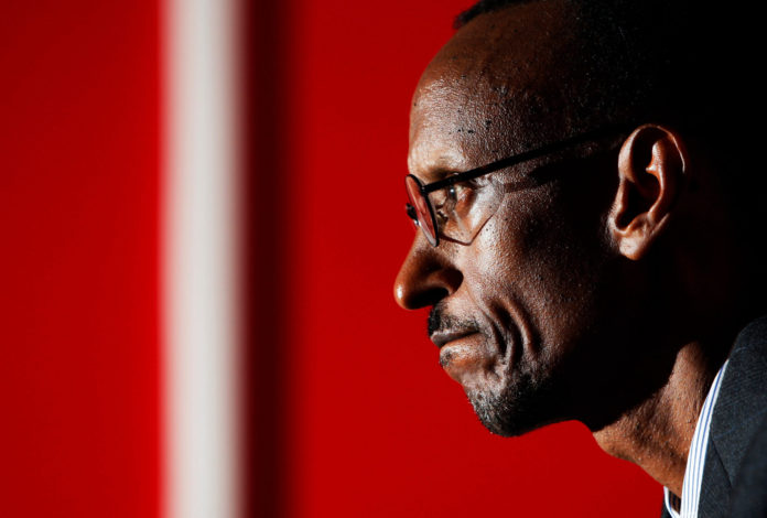
Featured Photograph: President Paul Kagame of Rwanda in discussions with the officials of the Russian Federation (13 June, 2018).
References
National Institute of Statistics of Rwanda. 2015. Rwanda Poverty Profile Report 2013/14
National Institute of Statistics of Rwanda. 2012. The evolution of poverty in Rwanda from 2000 to 2011: Results from the Household Surveys (EICV).
National Institute of Statistics of Rwanda. 2016. Poverty Trend Analysis Report 2010/11-2013/14
National Institute of Statistics of Rwanda. 2018. Rwanda Poverty Profile Report 2016/17
World Bank (2018), ‘Revisiting the Poverty Trend in Rwanda 2010/11 to 2013/14’, Freeha Fatima and Nobuo Yoshida, Policy Research Working Paper 8585.
Ravallion, M. (1992) ‘Living Standards Measurement Study Working Paper No. 88: Poverty Comparisons, A Guide to Concepts and Methods’, LSM- 88 FEB. 1992.
Notes
[1] The main change was made to the estimation of food consumption, where we now multiply the monthly consumption by 12 to get the annual total instead of multiplying by the number of months in which the respondents declared that they consumed the product. This modification ensures that the food shares we obtain for each item are almost identical to the food shares reported by NISR in NISR (2015), table B4 (see table 7 in annex for a detailed description of our consumption basket with the NISR 2014 4-step actual consumption basket). We therefore suppose that this new assumption more closely approximates the assumptions made by NISR in their own calculations. In addition, we now use the price index computed by NISR (centered on the survey-median) in order to estimate price level differences between regions and across months within each survey. Using NISR’s own price index removes one possible source of discrepancy between our estimates and NISR’s, and therefore allows us to focus on the other possible drivers of change.
[2] In our initial reaction to the EICV5 poverty profile, we had noted several inconsistencies in the official NISR result, which may point to problems in NISR’s calculations and would require independent verification (see comments below this post). Chief among them was the fact that NISR claimed that the national poverty rate had decreased faster than both the urban and rural poverty rates since 2014. In theory, the national decrease in poverty should correspond to a weighted average of the urban and rural poverty change, and should therefore lie somewhere in between those two numbers. Without further detail on the methodology used by NISR to compute their poverty rate, it is not possible to determine the source of these inconsistencies, nor to assess the validity of their calculations.
[3] Table 7 and Table 8 in the annex clearly show that consumed quantities decreased most for the items that increased most in price between 2014 and 2018.
[4] The food shares reported here differ slightly from those reported in our responses to the World Bank a few weeks ago (see here), as we have changed the method for computing food consumption to more closely approximate the official NISR results (see footnote 1 above and attached syntax files).
[5] In an earlier reaction to the EICV5 poverty profile results, which was posted before the datasets were released, we had estimated that the increase in poverty in urban areas outside of Kigali might have been as high as 17 percentage points (see comments below this post). This was because we had assumed that 100% of the population in Kigali City is urban, when in fact 25% of the population in Kigali City is rural. With this correction, the two estimates are consistent.
[6] The 2010-2014 trend was estimated using a slightly different methodology, as explained in footnote 1 above. This means that the reported 2010-14 and 2014-18 trends might not be exactly comparable. We will leave it to others to fine-tune these numbers and estimate historical trends going further back in time.
[7] Most crucially, the World Bank failed to explain or justify NISR’s sudden switch to CPI data, which had previously been deemed inappropriate by NISR itself for estimating food inflation in Rwanda (NISR 2012, p.34), or to explain why this new price data source generated such radically different poverty rates from the price data previously used by NISR for poverty estimations.
Annex
Click here for Tables 8 & 9 (EICV4 food baskets and EICV5 food baskets)


